We get so many question about paint from color to sheen and brand. In this post we are sharing the top colors we used in our design projects for 2024.
We will preface this by saying, every paint color will be affected by light and other materials inside and outside of the space.
We always recommend paint samples whether it be going to the store in picking up some pints that you can paint on the wall directly.
Or maybe you paint a board and hold it up in various light settings throughout the day to really get a feel of what this color is going to look like in your home.
We also love the large peel and stick paint samples provided by Sampilize. They ship right to your door and are a great way to get color into your home without even leaving.
Ready to get started? These are in random order. Here we go!
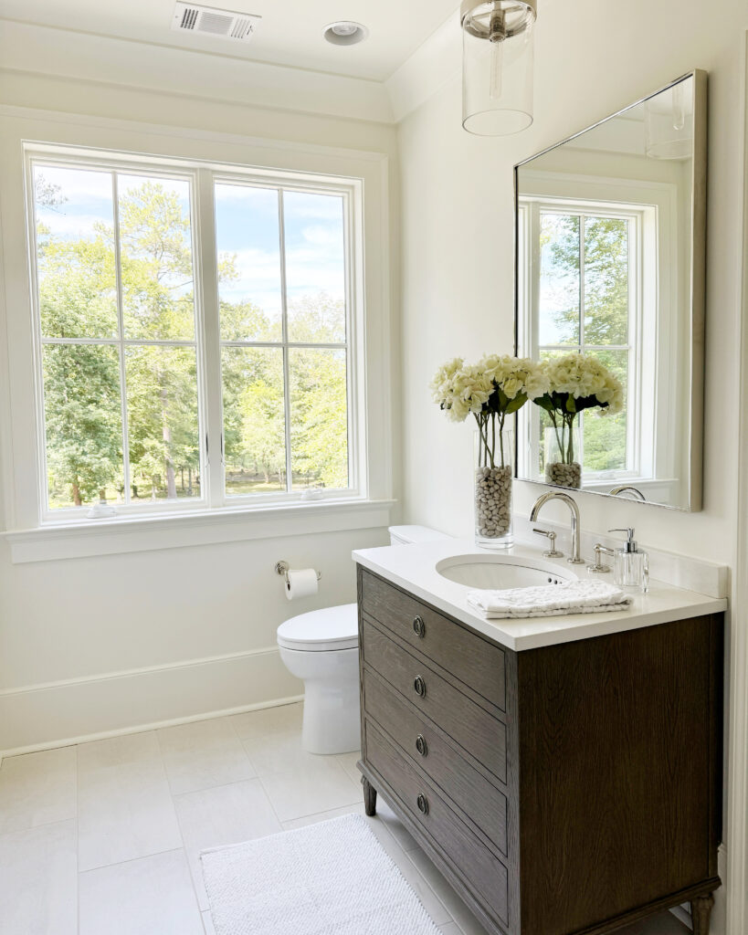
White Dove by Benjamin Moore

We love White Dove because it is a warm white that coordinates well in a home that needs a neutral base. It does have a slight yellow tint to it but with a lot of sunlight it is the most welcoming warm white.
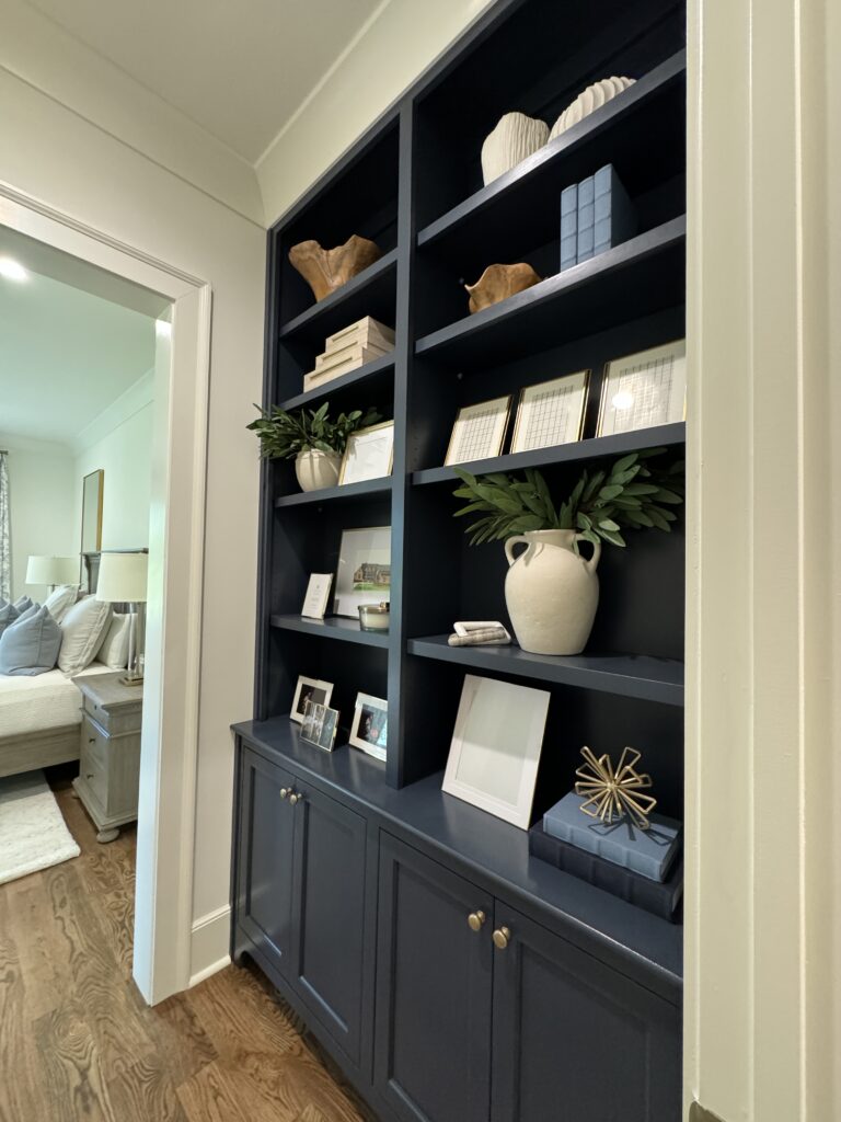
Hale Navy by Benjamin Moore

This color has been loved for many years and most of you have probably seen it before but a client brought this to us last year as a color he loved. We used it throughout his home on custom built-ins. It pairs so well with White Dove, Pure White and Alabaster.
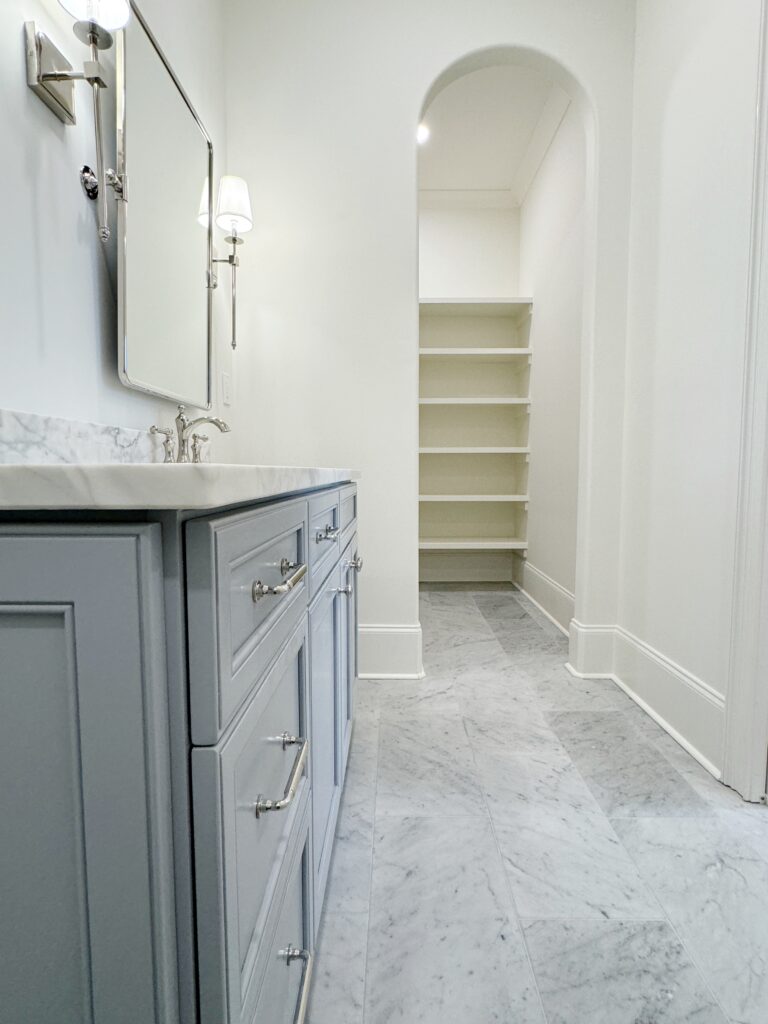
Pigeon Gray by Benjamin Moore

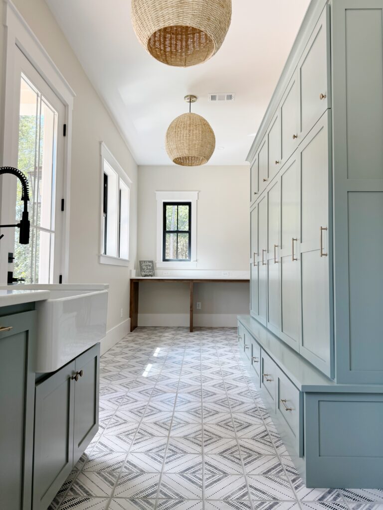
This first showed up in a secondary bathroom vanity for one of our custom home build clients. We loved it so much we offered it another client for a hallway desk and laundry room cabinetry. It’s a perfect shade of dusty blue with a hint of gray.
Pale Oak by Benjamin Moore

Pale Oak is such a wildly popular color right now. Many people are replacing their gray walls with this subtle greige paint. We have used it most recently for all of the walls in a custom home build. It paired so well with Snowbound.
Pure White by Sherwin Williams

We love Pure White because it isn’t too sterile. We think it is a perfect trim color for people who do not like whites with warm undertones. We have yet to find a color it doesn’t pair well with. We paired it in this renovation with Agreeable Gray trim.

Carolina Gull by Benjamin Moore

This is a new to us color and shows up a bit darker on this sample than it is in real life. We used it here in a laundry/mudroom as well as a prep kitchen.
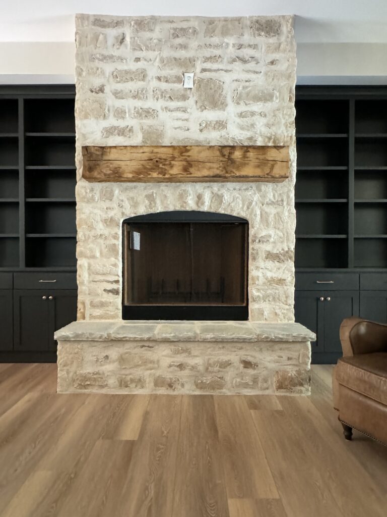
Iron Ore by Sherwin Williams

We can’t get enough of this deep charcoal. We have used it on islands, walls, trim, and bookcases. It never disappoints. The trick with this color is to make sure you have enough natural light to support it’s depth.
We hope you enjoyed this post. Have questions? Leave them for us in the comment section below.

leave a comment