We can’t get over the transformation of this outdoor space. Before it looked like this….
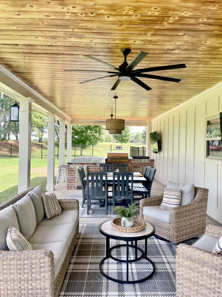
It looked like this…..
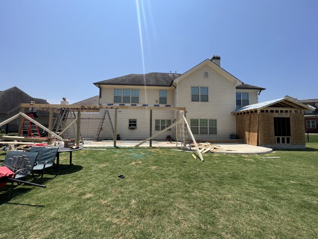
My clients called me during their initial phase of meeting with a contractor. We worked hand in hand to bring them a beautiful cover porch with space to relax, eat and prepare meals for their family of eight.
We chose to extend the concrete the entire left length of the house and added an additional 2 feet to the width to ensure enough space for all of their needs.
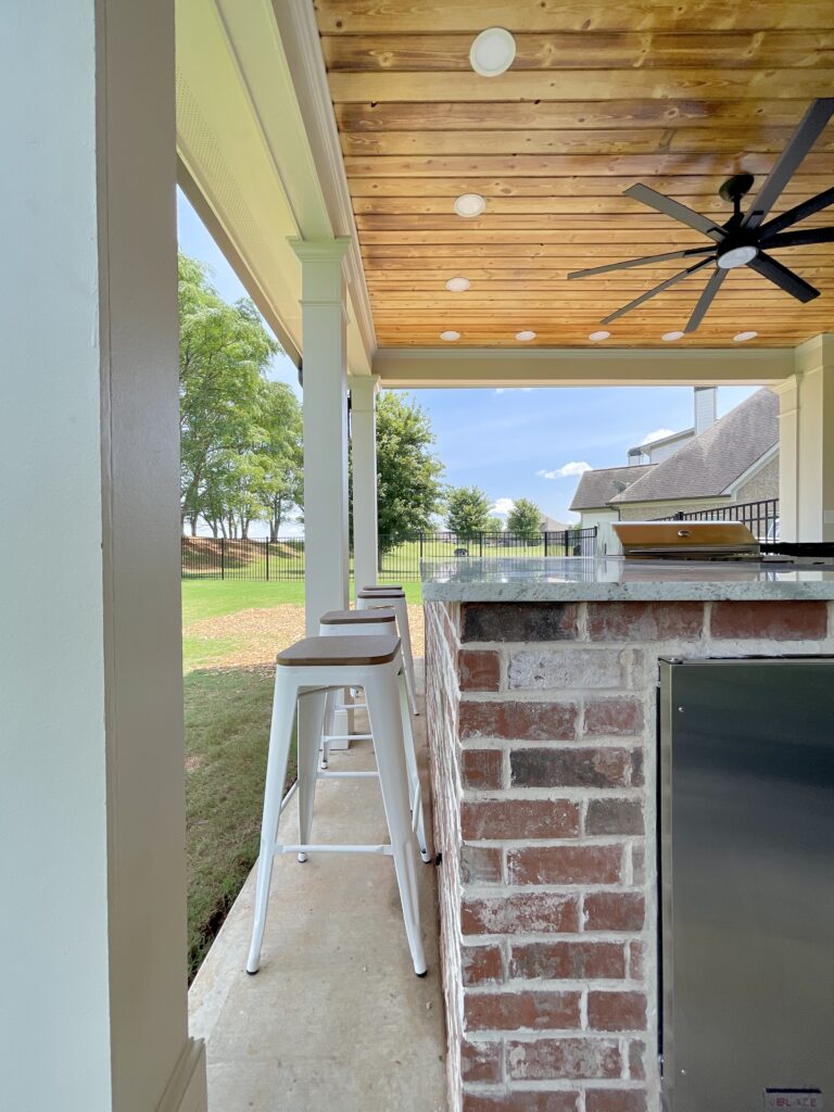
They chose to cover the porch and not screen it. Their family really wanted an open space without the fuss of high traffic in and out of doors.
They opted to replace the existing siding with board and batten and paint it their existing house color Sherwin Williams Sand Beach 7529, and all trim and columns Sherwin Williams Canvas Tan 7531. The door leading into the house is painted the same color as their front door Sherwin Williams Sealskin 7675.
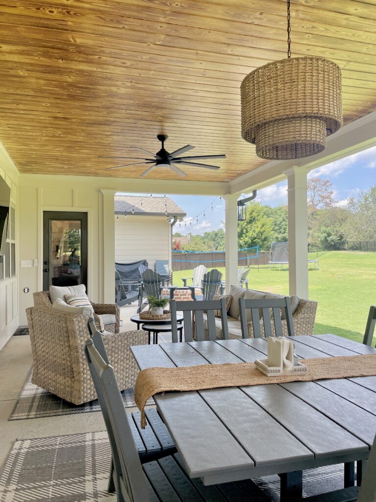
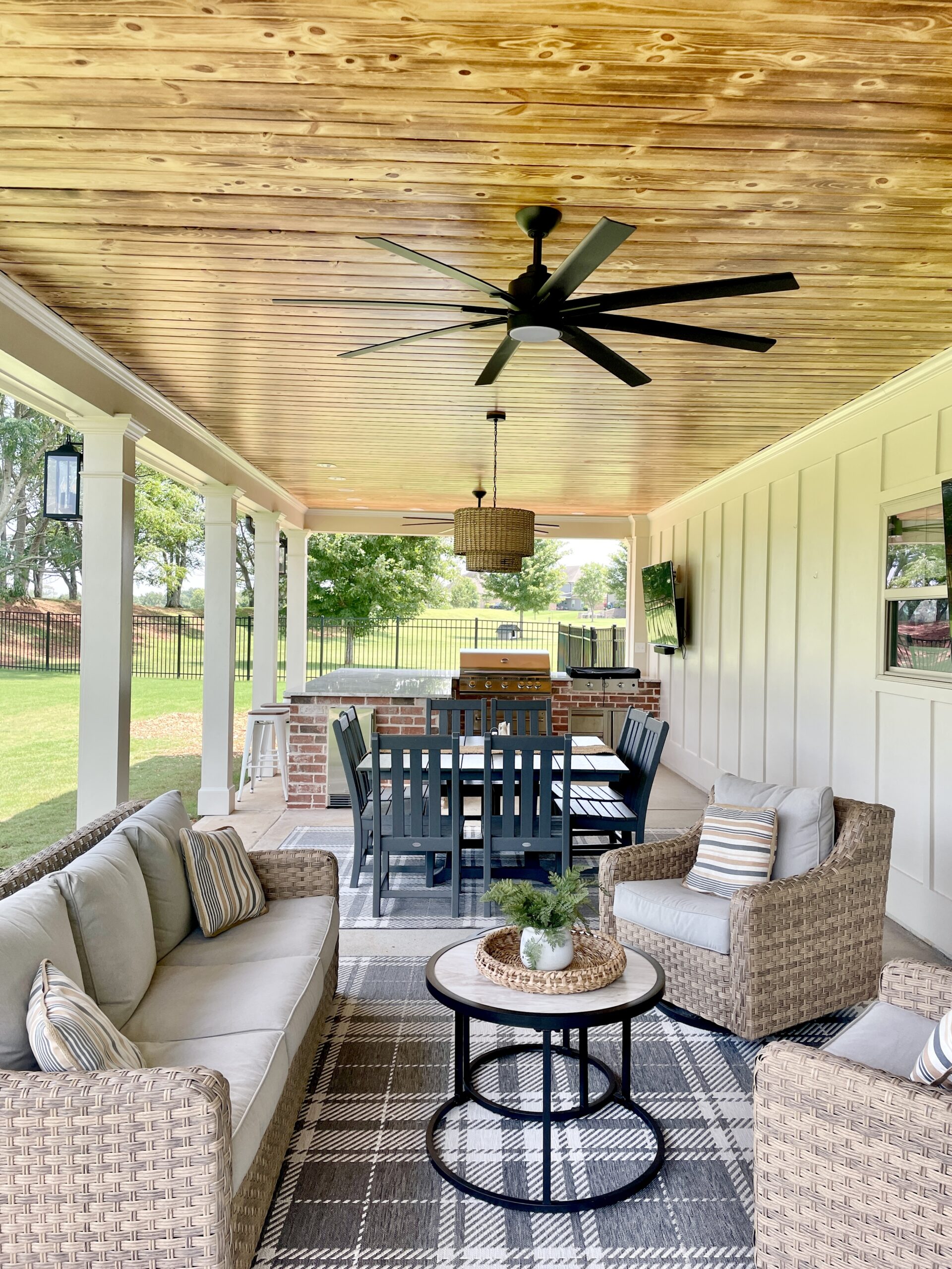
They opted for a burned tongue and groove ceiling with clear seal. This was a great option to bring in some warm tones to the space and hopefully decrease maintenance on this porch ceiling.

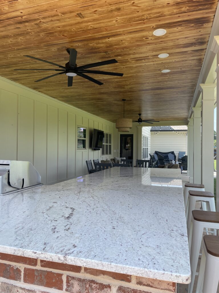
We optimized the space by dividing it into three different sections. One for conversation and lounging. Another for dining. And the final one for cooking.
We opted to put the outdoor kitchen at the far end of the porch for better ventilation and less traffic jams. Our clients worked with a local outdoor kitchen specialist to select the correct appliances for their needs.
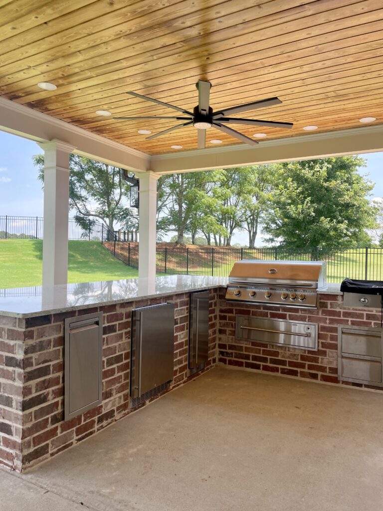
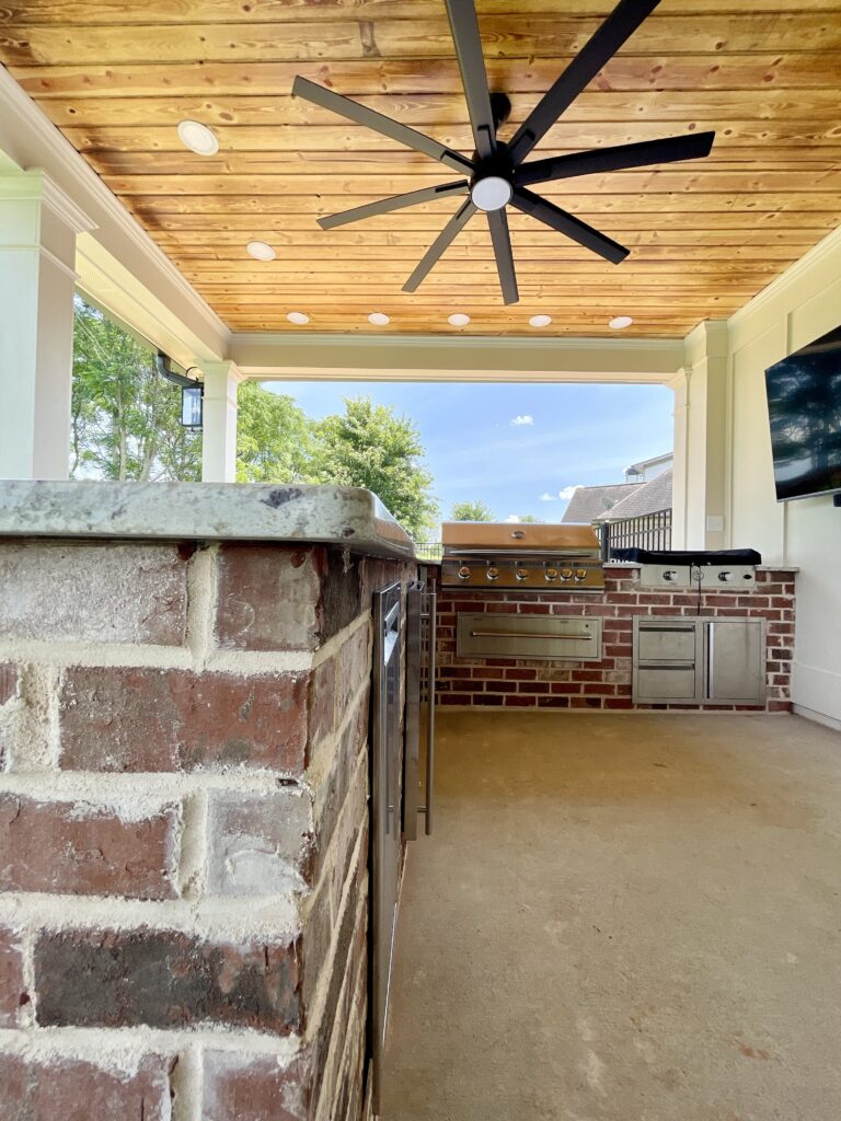
What I love most about this space is that we got to wrap the outdoor kitchen in brick. This home has brick on the front and the sides and we really wanted to bring that look to the back porch. Our vision was for this space to look cohesive to the rest of their homes exterior.
With a little bit of work, we were able to find a brick that is an almost perfect match to the original brick that was put on the home 10+ years ago. The brick used in this project was Old Fort Augusta by General Shale.
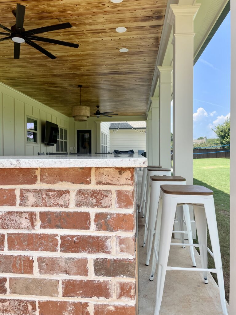
We topped the brick bar with Colonial Cream polished granite. The honed option was a little bit darker and we wanted to keep this space light and bright. We opted for an eased edge on the granite providing a simple and timeless look.
In the dining space, they needed seating for at least eight. A rectangular table ate into their traffic patterns. We suggested this square table from Polywood that seats eight or more.
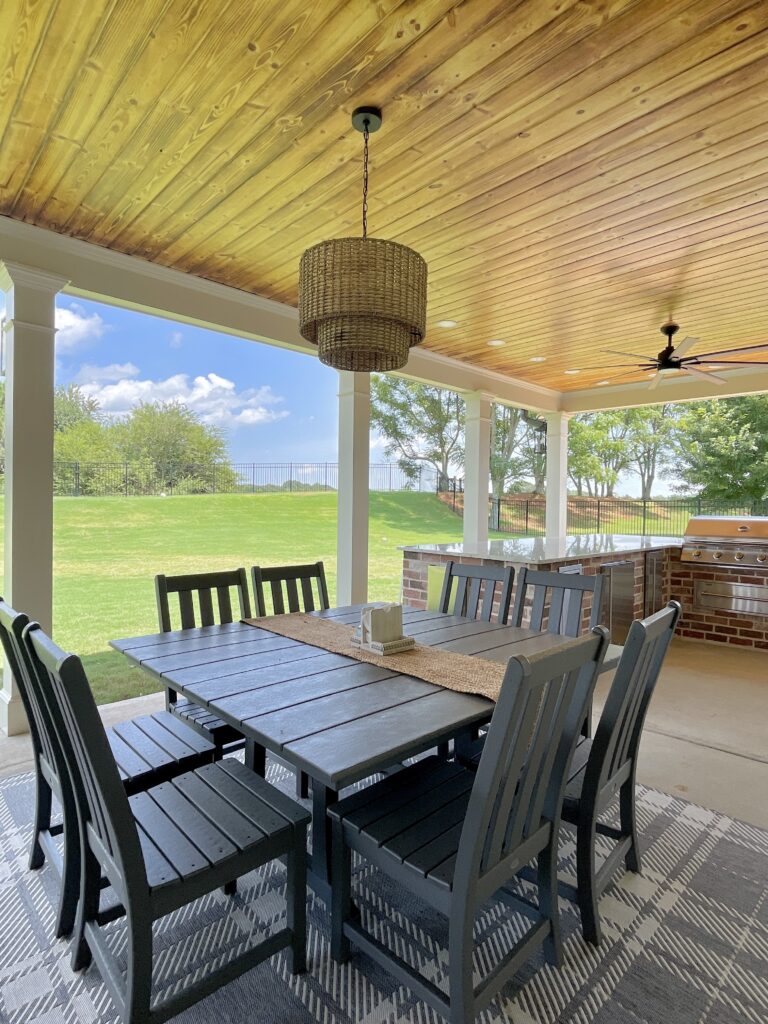
If you have been here any time at all, you know that we love Polywood furniture for outdoor settings. This table is sure to resist fading, rusting and decomposition. Want to learn more about Polywood and our honest review? Check out this article.
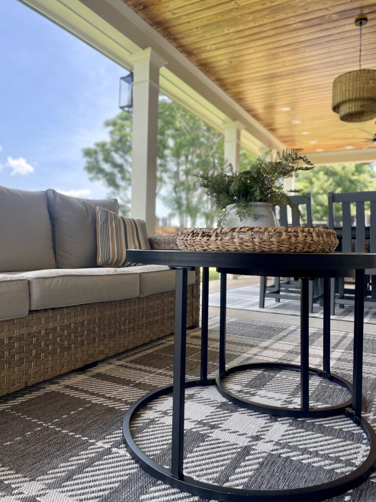
The final section of this space is filled with an outdoor sectional and swivel chairs that we have sourced for countless clients. The wicker is light and warm and the cushions are a great neutral that pairs with everything. We love this set because it is affordable and reliable.
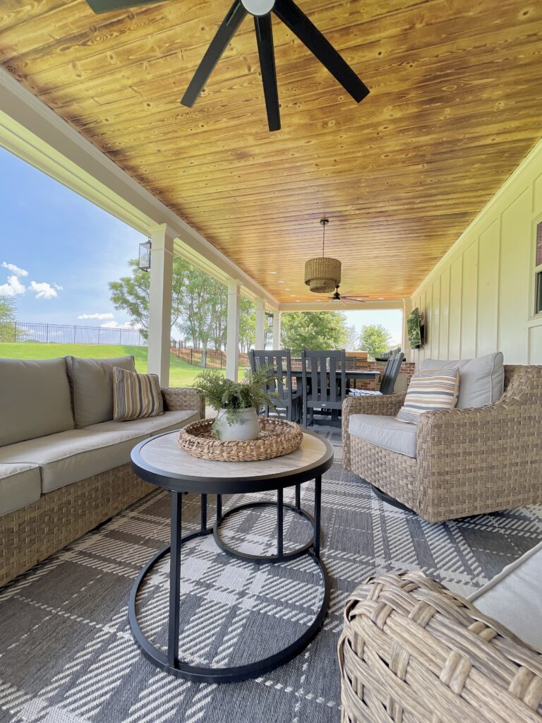
We anchored the dining and lounging areas with these gray plaid rugs. When we unrolled them, they were just what we had hoped. They help to tie in the gray of the dining table and chairs as well as add a fun texture and pattern to the space.
And for the final space, they opted to put in a smokeless fire pit surrounded by adirondack chairs. String lights were installed across the open space to give the space some ambiance at night.
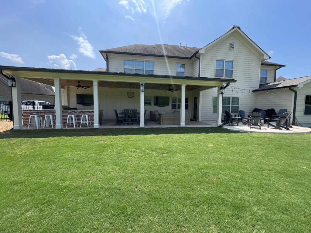
We love the Estate Project and hope you do too. We have linked all furniture pieces we used here.
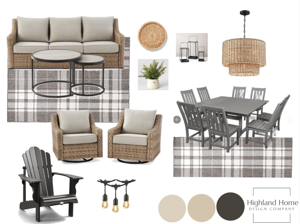
Go check it out. As always, we are most grateful when you use our links to order. It is just another way to support our business.
Blessings!
leave a comment