Did you grow up in a house with box molding or picture frame molding under the chair rail?
It probably was found in a formal dining room, entry hall or an office. It could often be found painted white or a beige and the wall above a contrasting color, maybe blue or red or tan or yellow. Or maybe there was wallpaper above the chair rail. Any of those images ring a bell?
About two years ago, I saw it coming back in design. But this time around, it didn’t stop at the chair rail, it extended all the way up the wall and somehow elongated and elevated the room.
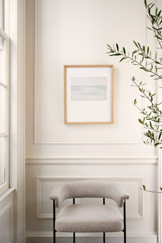
Picture frame molding boasting light and dark colors alike where the trim and wall color are the same. This molding somehow steals the show and everything else is just added to its beauty. Would you agree?
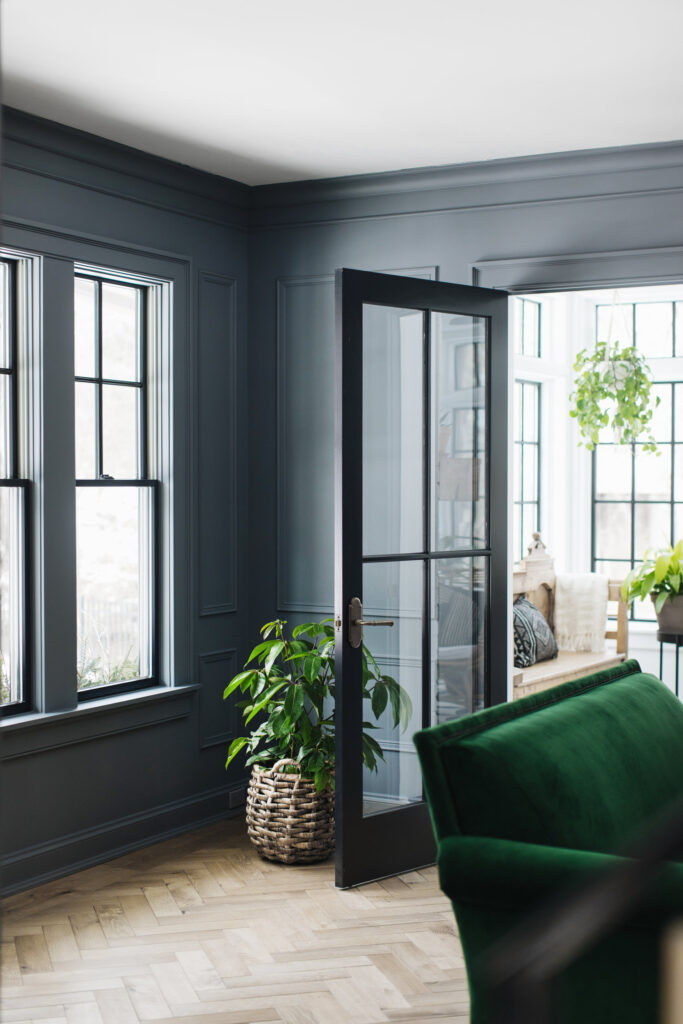
I love using this enhancement to help blank walls feel cozy and clean.
I am not one for putting a photo, a picture, a shelf or a mirror on every single wall.
I honestly believe spaces with large design elements tend to feel more open, cozy, welcoming, well thought out and breathable.
My mind loves to walk into spaces and take it all in. Those spaces usually have a few key pieces that bring a sense of warm and wow.
I bet if you and I took inventory of the things we have pinned on Pinterest, we would share boards with images of clean, breathable spaces where large items and architectural design reign.
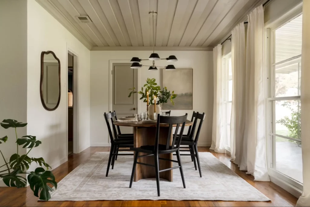
Here are three of our client’s homes, where picture frame molding has been the star of the show. We recommend trying out these three options in your home as well.
ENTRYWAY: This home welcomes you onto it’s large brick paved porch. You step through those double front doors into a rectangular shaped entryway leading into a open concept living space.
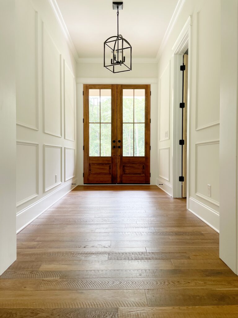
Our clients wanted something special in this space but did not want to add a lot of decor here. In walked picture frame molding and we painted it nothing less than Shiplap by Magnolia.
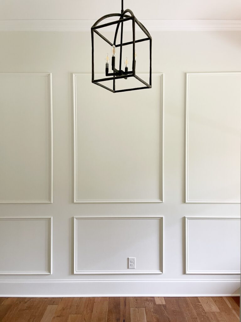
The important factor in this design was to elevate the entryway so that the woodwork became the focus.
We balanced the medium brown engineered hardwood floors with light walls.
And we added in a touch of black in the chandelier, because every space needs a touch of black.
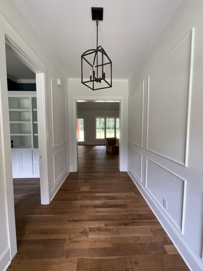
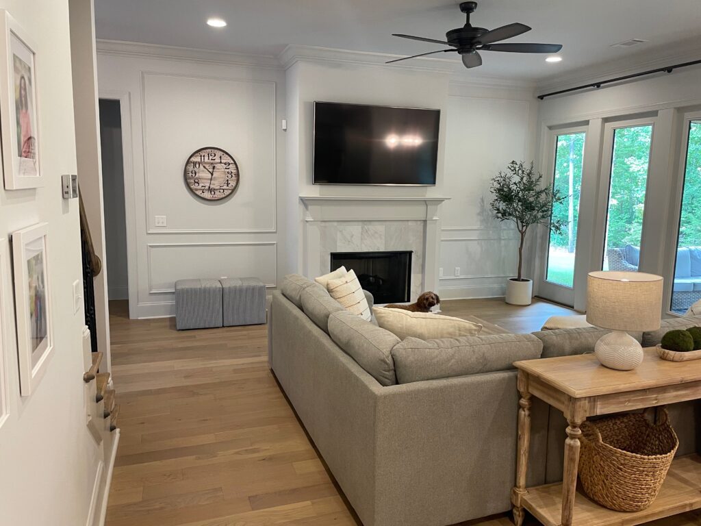
LIVING ROOM: This home has an open concept living room and kitchen. This client loves neutral design with a very minimalistic decor. This space has two very large walls on each side of the fireplace.
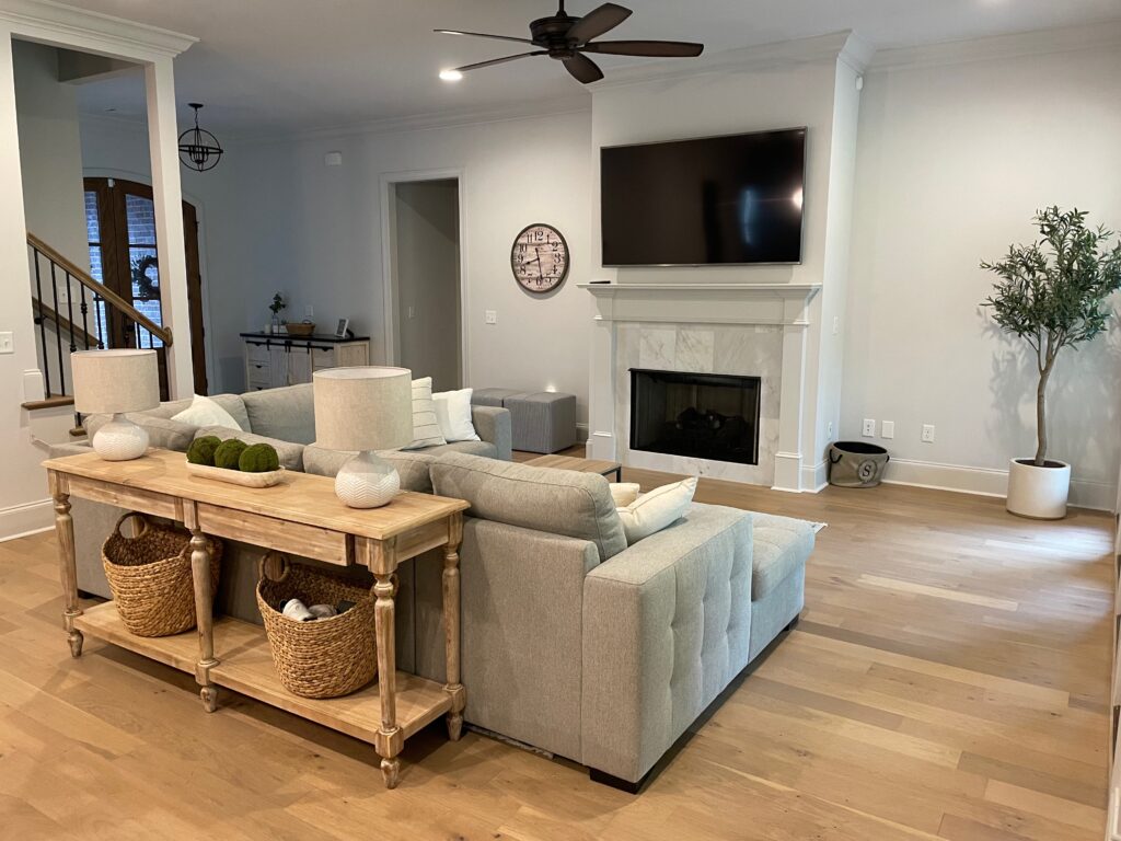
Storage was not an issue for this client, so adding bookcases on each side would not serve their family well and would spend money that really didn’t need to be spent. Instead, we opted for picture frame molding.
The client’s watched a few tutorials online and knocked this project out in a weekend. They painted the molding to match the existing wall color, First Star by Sherwin Williams.
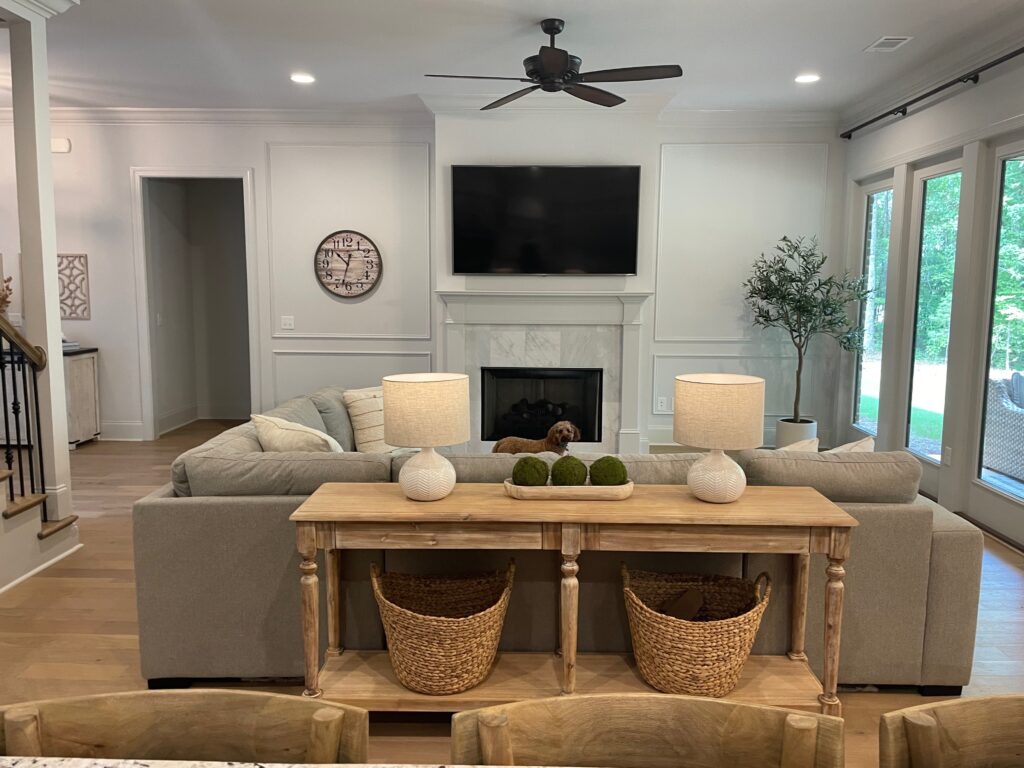
We added in 2 ottomans for additional seating, a large potted olive tree and a extra large beachcomber basket for blankets to fill the empty space on each side of the fireplace.
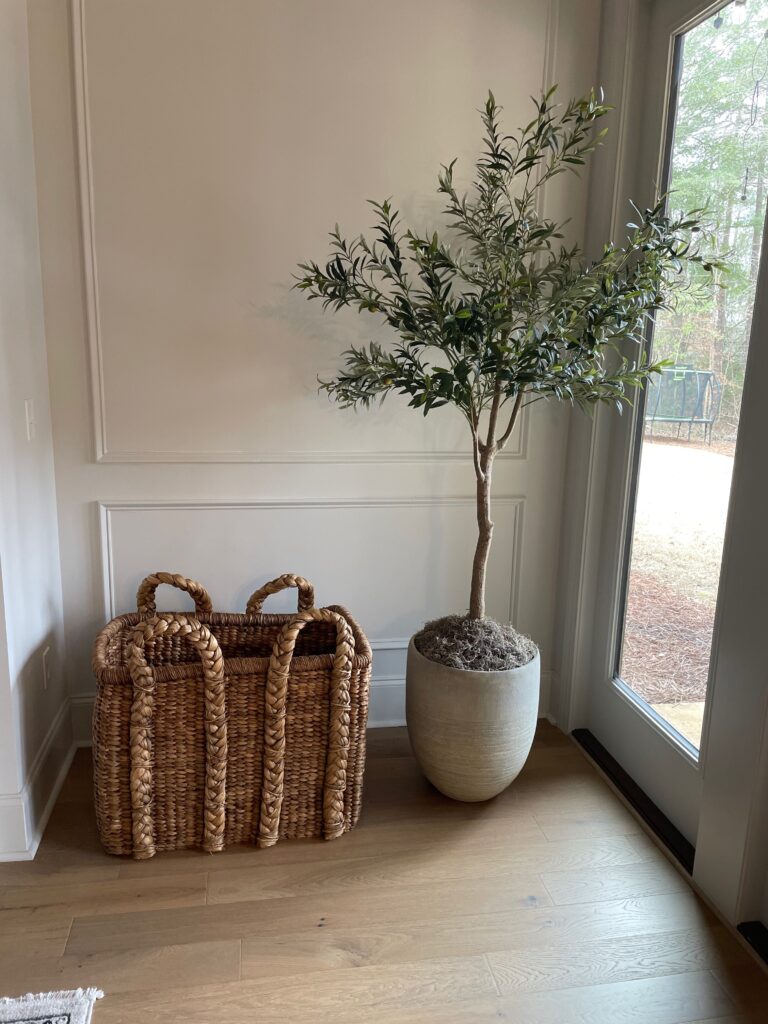
Large potted olive tree to add some color and texture to this space.
DINING ROOM:
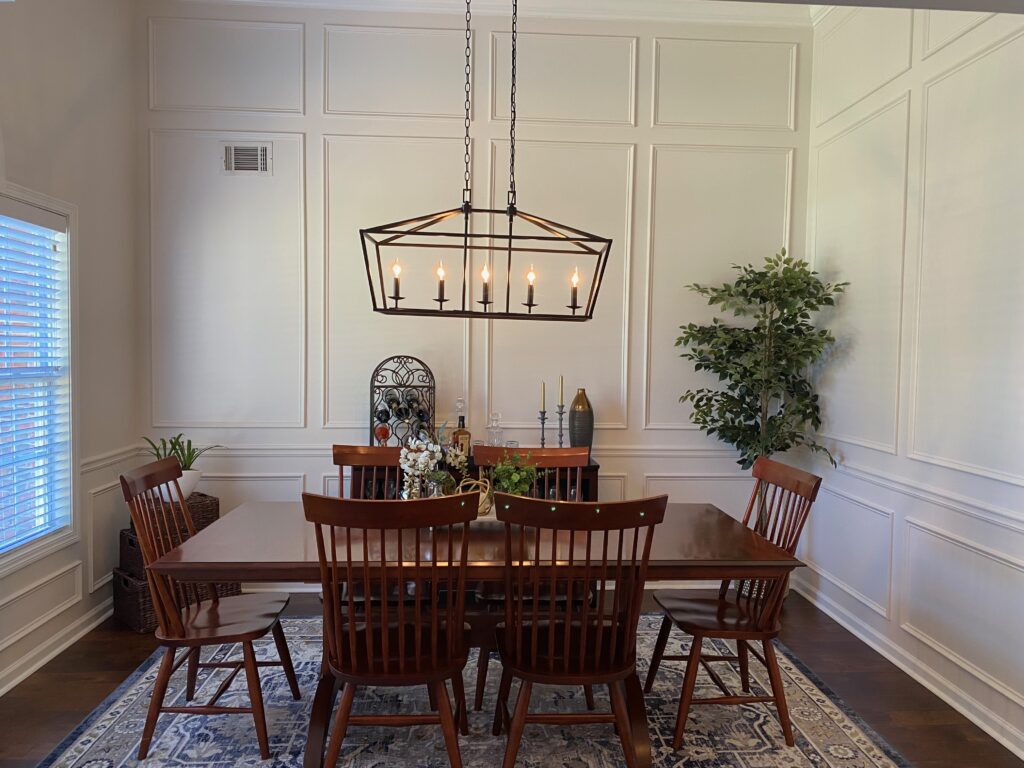
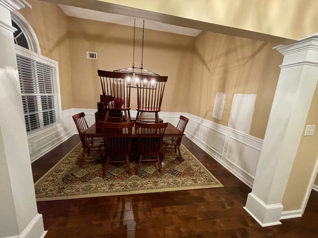
This home has a formal dining room right off the front entryway. The moment I walked in I knew exactly what needed to happen in this room.
If I remember correctly, the homeowners said they had thought about removing the chair rail and picture molding and just painting the room a solid color. Or choosing a different paint color and just painting the wall above the chair rail a new color.
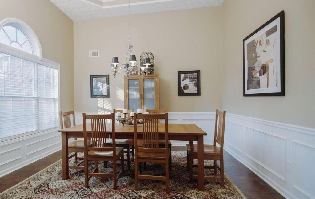
As seen on initial consultation
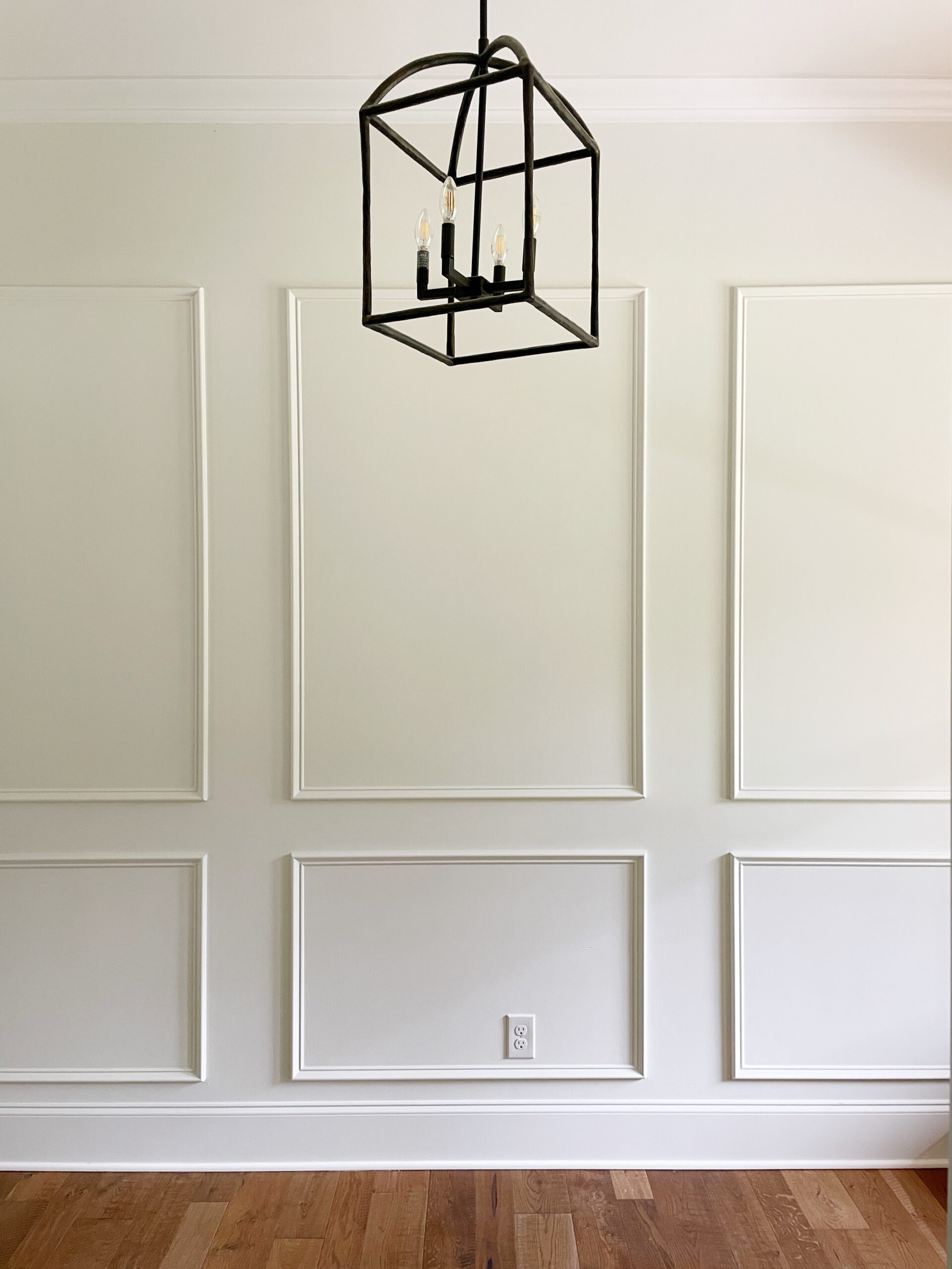
I surprised them with, “What do you think about picture frame molding to the ceiling and let’s paint it Shiplap by Magnolia?”
I shared my vision and a sample of the paint color with them and they bought in.
Again my goal here was the elevate the space, make it feel larger, and balance their darker toned floors with light walls.
They hired a trim guy and knocked this project out of the park.
Did you notice how the molding now becomes the wow factor?
It’s almost as if it becomes part of the decor. Love how a table, chairs, rug, sideboard, and potted plant are all the decor pieces it took in this space.

I truly believe in making investments in your home that are timeless.
Invest in pieces that will last.
Add in a few pieces that you might change out over the years: a plant, a light, a rug.
We love helping our clients save money on decor and design by providing them with our experience and expertise.
Need design help? We would love to start the conversation with you. Here’s how to reach us:
- Leave a comment in the comment section below
- Email us thehighlandhome@gmail.com
- Send us a message on Facebook
- Send us a message on Instagram
- Connect with us over on Pinterest
As always, thank you for following along. I’m so glad you are here!
leave a comment